Grab viewer attention:
As the world evolves around us, so does design. Like most of us, it goes through phases as it ages; some trends stick, and some are better off forgotten. In this post, we’re talking about emerging ideas in the design world, and how to integrate them throughout the year.
Pantone 2017 Color of the Year: PANTONE 15-0343 Greenery
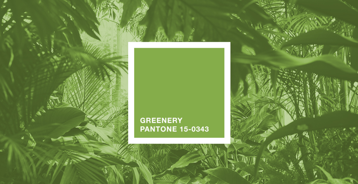
Greenery has been trending throughout 2016 in fashion, interior design, and across the web. This year’s Pantone Color of the Year Nomination continues the trend with the yellow-green continuing to grow in popularity. The Color Institute describes Greenery as “fresh and zesty”, “refreshing and revitalizing”. The color pairs beautifully with earth tones and metallics, transitions well to deep blues, and comfortably complements coral reds.
Offer: get a free website report and tips on how to improve your site.
Sustainability is finally starting to be topic people discuss openly--even the Pope. This year, expect to keep seeing more businesses position themselves as environmental stewards and engage in climate change activism. Designers can use Greenery in branding to signal environmental awareness.
Apart from environmentally focused brands, this springy shade also conveys renewal and innovation, so it’s still a great option for startups, disruptors, brand overhauls, change candidates, and nonprofits seeking to create positive changes in the new year.
Emoji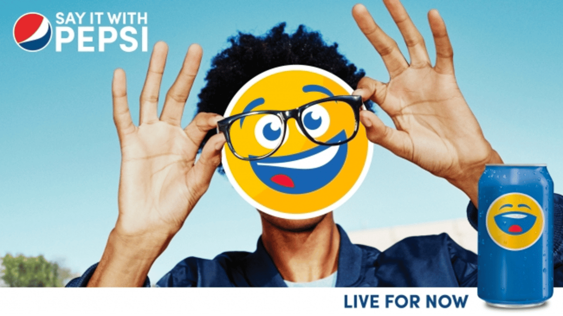
Pepsi Billboard via AdWeek
Emojis have seen a rise in popularity in recent years, and as they continue to become work-appropriate and used in mainstream communication, we can expect to see a rise in emoji usage in advertising and messaging this year. As anyone who has checked email in the past year will know, emoji have even made their ways into subject lines of email blasts.
Micro-interactions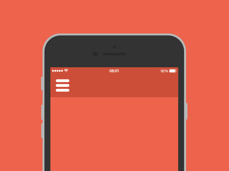
solveburger-kojo
Hamburger Menu by Tomas Kojo
While technology keeps evolving, it has allowed interactions between humans and computers to continue feeling more organic. In 2017, users don’t just click through a website or use an app; they actively interact with it. Nowadays, UI design is less like a story and more like a conversation.
Websites and applications in 2017 will continue to feature micro-interactions. Good interface design allows users to have an extra layer playfulness without overdoing it. Micro-interactions explore different possibilities between traditional desktop and laptop to mobile phones and wearables. Websites can incorporate hover states that change colors, modify images, and animate transitions to bring life to designs. The key to micro interactions is to implement them effectively while not distracting users from content or impacting load times.
Offer: Website design and development, on time and on budget.
While to some folks, this change in user experience design goes unnoticed, we take these small reactions for granted when interacting with a digital product. These little details are what separate a good app from a top-rated in the app store and a beautiful website from the site of the year. Using an interface that was designed a few years ago will feel lackluster, but it’s not the luster that’s missing. . . it’s the micro-interactions.
TL;DR
Design in 2017 is all about new possibilities! The color of the year is a vibrant green that feels like freshness and renewal. Normal words don’t do it for us when it comes to expression in text: we want emoji! The best applications and websites are capitalizing on that desire, and delivering interfaces with personality. Coupled with micro-interactions, users are interacting with technology in more ways than ever; think reactions on Facebook and Slack. In terms of digital design, 2017 will be the most interactive year yet.
Do you share the love for Pantone 15-0343? Think the Chevrolet Emoji Ad Campaign was lousy? Want to learn more about micro-interactions or some cool product examples? Let us know in the comments!


Let Us Know What You Thought about this Post.
Put your Comment Below.