Definitions & Design Tips for Engaging Landing Pages
Sailing the seas of the internet, users debark from their digital ships coming from a variety of places: direct links, Google searches, social media posts and digital advertisements. If they arrive at your landing page, how you approach the creation of the page makes or breaks the entire experience. Consider having a digital audit conducted of your landing pages and website to constantly improve your user experience.
Visitors coming to your website have to feel comfortable and have their next choices clearly marked. How your users interact with your site should not be random; it should be predictably aligned with your goals. Why are people coming to your website? Designing your site from the perspective of the end-user instead of the viewpoint of your organization is the most effective way to increase conversions.
For example, if you are a team of young folks with 20/20 vision, but your website exists to provide information to the elderly, your site should be easy to navigate, limit user intuition (e.g. unlabeled icons), and use large sized fonts. It should have imagery your users relate to, not what you think looks cool. The best way to learn what is helping your landing page and what is hurting your landing page is by testing, testing, testing.
What is a Landing Page Anyway?
Generally, there are two types of landing pages used depending on your goals.
Click-Through
If you want your visitors coming to your site to take a specific action, especially one that can be difficult to decide such as volunteering or purchasing a product, you need a Click-Through Landing Page. The idea of a click-through design is to direct traffic through an encouraging and inspiring experience to “warm them up” before they ultimately have to make a decision. Clicking an advertisement that leads straight to the checkout window for a product will always be less successful than linking to a landing page that builds trust with reviews, demos, and photos before ultimately asking to buy the product.
Lead Generation / Data Capture
While click-through landing page designs are focused on taking action or making sales, Lead Generation or Data Capture Landing Pages are designed to gather information, often to direct leads to take actions at a later point in time. This is a good approach for passive strategies that include building followers and segmenting email lists. Although engaged users can connect immediately by registering their name and email out of pure interest, the winning strategy includes offering an incentive. We’ve all see the “carrot” design before, but perhaps did not notice its effectiveness. “Carrots” are incentives to sign up—freebies that require adding your email to a list or paying with a Tweet in order to get the reward. Some common giveaways are:
- Launch dates for products and campaigns
- Updates / Newsletters
- Free Trial / Product Demo
- EboEmail course / drip campaign
What People Talk About When They Talk About Conversions
The Fold
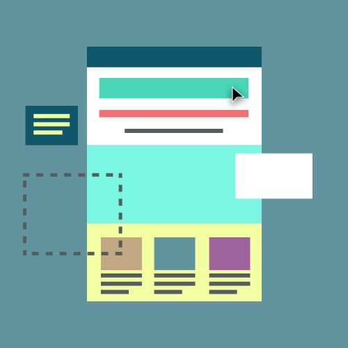
The fold is the bottom of your screen. That doesn’t mean your page ends there--if you have to scroll down the page to access the rest of your page content, this area is called below the fold. In this age where a computer is in every pocket, screens come in all shapes and sizes so considering where your content is in relation to the page fold is key.. If your website is not optimised to accommodate users on all devices and internet browsers (yes, people still use Internet Explorer), you are WAY behind. That being said, being conscious of the fold is vital your landing page. If you feature any advertisements above the fold, you immediately lose credibility to your audience. It makes you look like you care about money more than helping the people visiting your site. How do you choose the content to place above the fold? We recommend that you build credibility right away-- that might be a logo or a testimonial ( the “proof”) and then direct your visitors what to do next. At the end of the day, your visitors will tell you their preferences if you run effective A/B testing.
The Most Important Take away
To read the rest of this blog post, enter your email below.

Just kidding! Have more questions about the anatomy of a landing page? Are there creative sign-up incentives not listed above? Let us know!
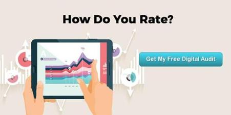 Having a digital audit of your integrated presence can open your eyes to areas you are doing well but also where you are missing opportunities. For a limited only our team is providing you with a free mini digital audit. Fill out a brief form and we will review your web presence and provide you with a review via email.


Let Us Know What You Thought about this Post.
Put your Comment Below.